From Layouts to Flow: How Web and Interior Design Mirror Each Other
By Derek Velzy
View on Medium

Many of us have walked into a friends home and felt instantly at ease. The sunlight from their window reflects off a piece of artwork revealing subtle brushstroke details. Conversations with friends around the coffee table feel lively and energetic, yet comfortable. The space feels interesting and dynamic, with plants on floating shelves, pendant lamps, and picture frames guiding your eyes up from floor to ceiling. You can’t quite describe it, but you know it’s well-designed. If you are that friend, then you know that this feeling wasn’t accidental.
I recently moved into a new spot in a new town with my girlfriend. When you live with roommates, your shared items are subject to some wear-and-tear. So when we moved to the new place, we didn’t have much. A total clean slate.
As we started planning the space and collecting furniture, I was consuming a lot content on interior design — from Medium articles and reddit forums to YouTubers with large followings. As I was taking notes, the same sort of design suggestions started to repeat themselves: The furniture shouldn’t be flush against the walls. Choose a color palette before starting — go with a base and accent tones. Every space needs a focal point like the TV or fireplace, so position the items in a way to draw attention towards it. This all started to sound very familiar.
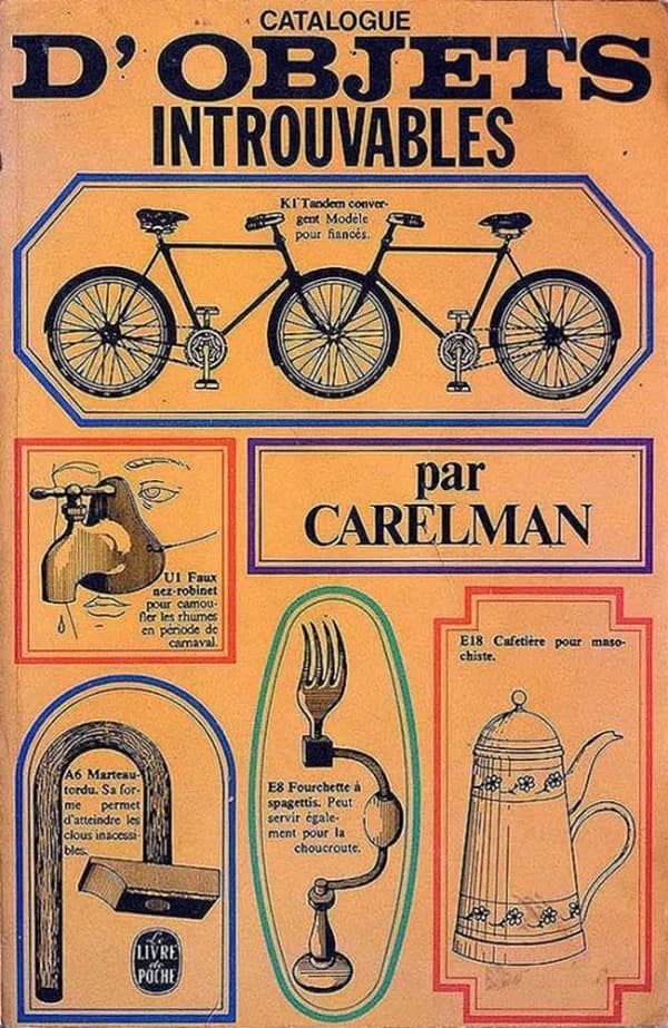
Like many others interested in UX, I picked up a copy of the highly recommended The Design of Everyday Things (DOET) and began reading. To my surprise, this wasn’t a book about how to design a website. Many of the examples given in this book were about the designs of doors, sink drains, elevator buttons; literally just “everyday things”. After reading further, the comparisons to UI/web design became obvious, especially when it comes to interaction and accessibility. Affordances and unambiguous signifiers allow us to accurately predict what will happen when I interact with a component. But these ideas aren’t exclusive to user interface design or elevator buttons — these are just a few of the principles of Human-Centered Design.
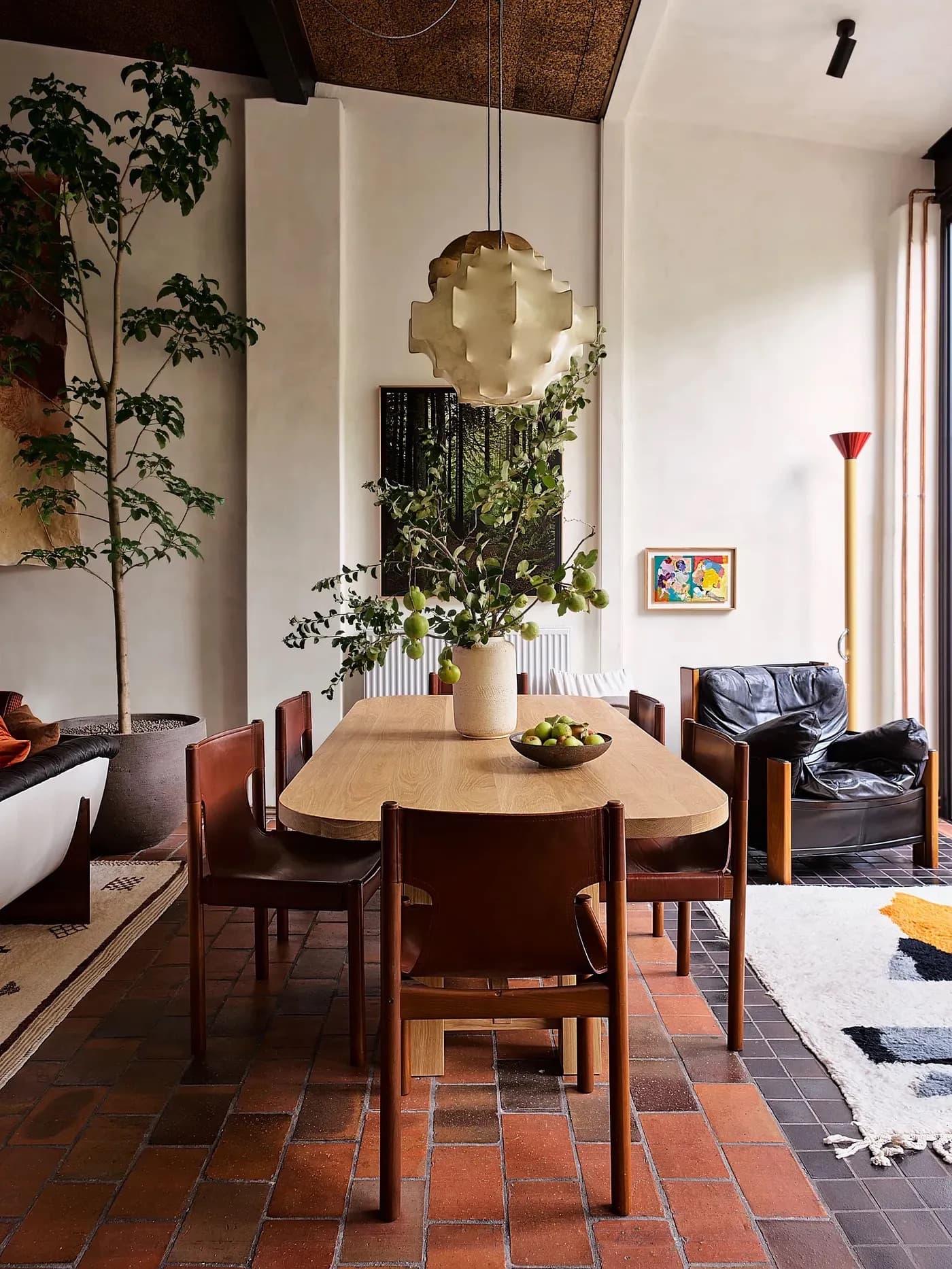
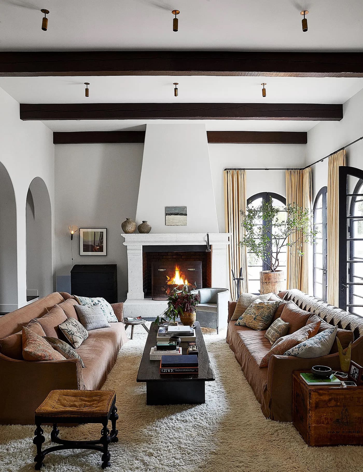
Before there was the idea of Human-Centered Design, however, there was Function-First Design. Function-First Design was introduced in the late 19th century by the “father of skyscrapers” — Louis Sullivan. Sullivan was an American Architect also known as the “father of modernism”. He famously coined the phrase “form ever follows function,” a mantra later adopted by mid-century modern designers (no, not “slanted legs on every piece of furniture”). This movement emphasized purpose first, honest materials, and the elimination of anything unnecessary. Items in the home were supposed to be primarily functional, minimizing ornamentation. Honest materials — wood, metal, glass, and stone — are typically more durable and purposeful. But if form follows function was the only principle from mid-century modern design, then we’d all have spaces that look like the first image below:
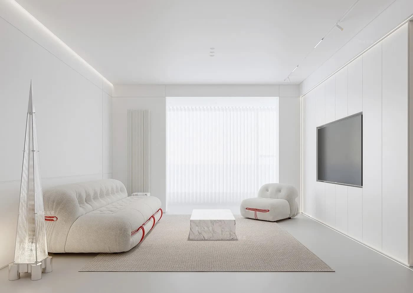
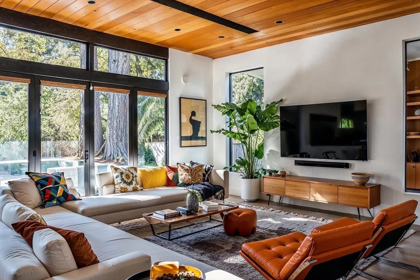
While I may be biased to mid-century modern design — and it is not for everyone — I believe there is an undeniable warmth and character to it that minimalism doesn’t achieve. The combination of different materials and textures create contrast and emphasize specific pieces. There are still many items in this room, but you can also see the openness and space to walk around easily. You might ask “what does artwork, floor plants, or decorative bowls have to do with function?”. You can probably spot many objects in that room that don’t serve any utilitarian function. Mid-century modern is not a rigid rulebook to follow; it’s a philosophy that questions where function ends and feeling begins.
We are all human. We gravitate more towards rooms that provide a feeling of well-being, comfort, and visual harmony. You can argue that artwork doesn’t have any utilitarian function, but it sets an emotional tone for a space is kind of a function. While modernist design and Human-Centered Design are not technically the same thing, this is where I see the most similarities.
Human-Centered Design emerged after modernist design in the mid-20th century. While the actual term of Human-Centered Design came later, it was Stanford professor John E. Arnold who taught that design should start with human needs. Professor, researcher, and the author of The Design of Everyday Things, Don Norman expands on this idea. To pull directly from the book, Human-Centered Design is…
The process that ensures that the designs match the needs and capabilities of the people for whom they are intended.
To me, HCD feels like an evolution of modernist design. It goes beyond form follows function, and applies cognitive science to determine what functions are most important for real people.
The Similarities Between Interior Design and Web Design
Flow
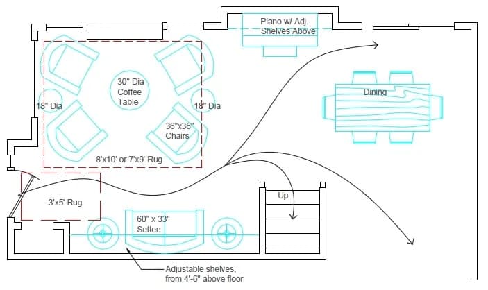
When designing a space, one of first things to ask is: How do you want people to move in this space? Where are the entrances and exits? How do people experience the space when they’re in it? Can I turn on a lamp from my reading chair without getting up?
Flow is also about meeting common expectations. At a grocery store, I usually know where to find the produce section. In a living room, good flow would ensure that I’m able to enter the room without obstruction, and that the furniture faces in a way to encourage conversation or a shared activity, like watching the TV. A cabinet half in the living room and half in the dining room would throw off the feeling of that room and would create poor cohesion.
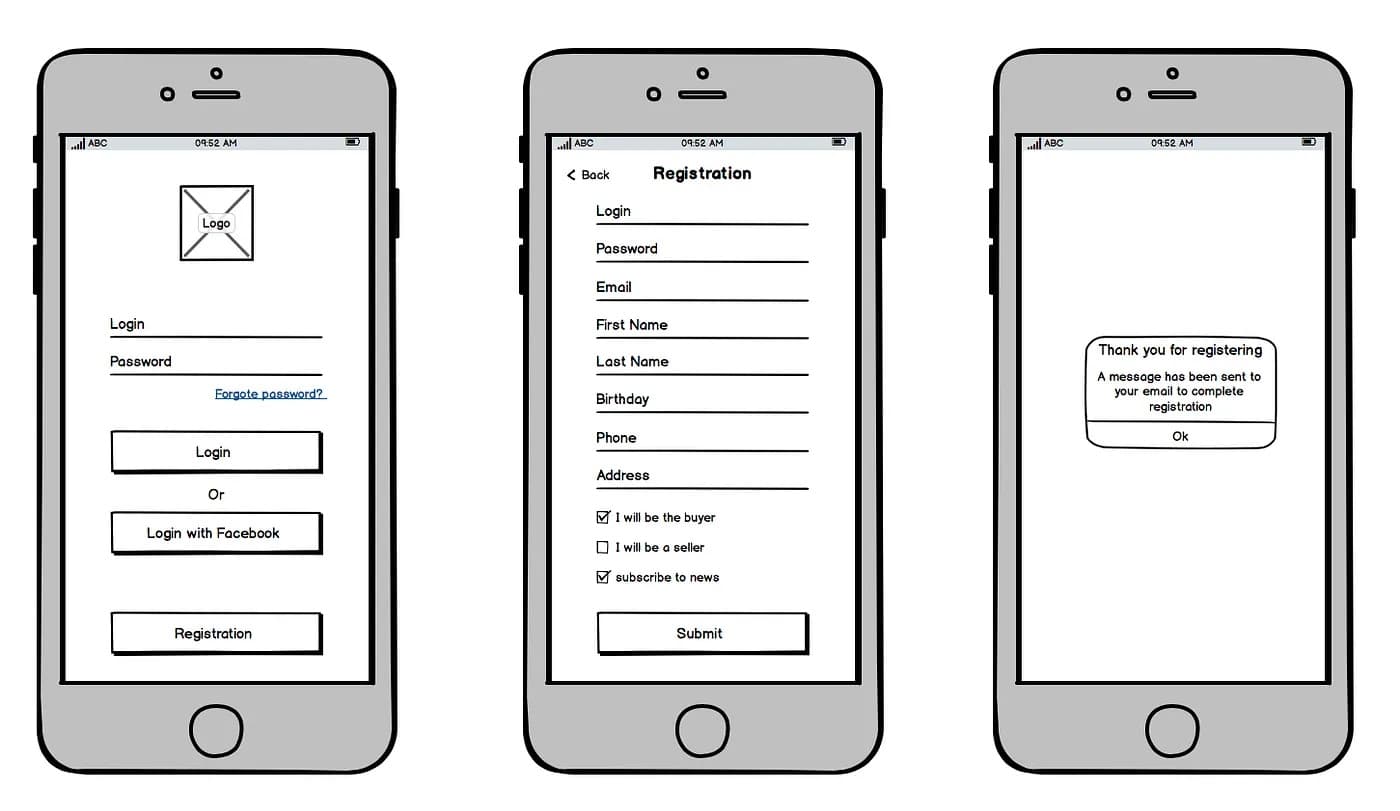
Flow is just as important in the case of web design. When someone lands on your site, is it clear what they should do next? The navigation, CTAs, scrolling behavior, breadcrumbs, and transitions should feel expected and intuitive. Creativity is encouraged to find personal taste or follow brand guidelines, but if your site starts to become to “avant-garde”, users can become lost.
Accessibility and Inclusion
Accessibility is far too often overlooked in the physical and digital world. Studies have shown that roughly 16% of the global population have some form of disability and require web accessibility. When designing a space for the public to use, such as an office or retail store, the Americans with Disabilities Act (ADA) has requirements regarding unobstructed routes, entrance widths, parking, door handles, and many more.
Just like buildings must meet ADA standards, the web has its own: the Web Content Accessibility Guidelines (WCAG). In fact, under Title II of the ADA, all state and local government websites are required to comply with WCAG 2.1 AA standards to be compliant. An acronym often used in the context of web accessibility is POUR:
Perceivable: The content must be visible and unobstructed.
Operable: The site must be usable with the use of a keyboard or alternative inputs.
Understandable: Proper contrast, labels, and font sizes are crucial for ease of comprehension.
Robust: The site needs to work with a variety of assistive technologies. Accessibility is not a one-size-fits-all.
Hierarchy
All well-designed spaces have a clear focal point. In the dining room, it’s a dining table. In the bedroom, it’s the bed. And in a home office, it’s the desk. If these examples all seem obvious, it’s because they are. Web pages can be thought of in the same way. Hierarchy is about guiding the eye to what’s most important.
When I visit GoodReads, I don’t know where to look (sorry GoodReads). There is uneven vertical and horizontal alignment everywhere. There are too many CTAs and links fighting for my attention. I see poor contrast between text, background, and interactive elements. There are many inconsistencies in font families, sizes, and weights. Pinterest, in contrast, still has many interactive elements, but they are neatly organized into groups. The sidebar element on my left is clear and legible. The search bar behaves like I expect it to. A list of my boards lie right below the search bar, and right above all the posts. Hierarchy isn’t about a single element, but instead the organization of groups, contrast, rhythm, and alignment — all working in harmony to direct our attention to where it needs to go.
Affordances and Signifiers

Two important concepts from DOET are affordances and signifiers.
Affordances can be thought of as the relationship between the properties of an object and how humans perceive and interact with it. For example: with my coffee cup, I can hold it by the handle or just the cup. I can pick it up, pour coffee or tea in it, or even throw it. An affordance seems like a simple concept — like obviously I can look at an object and do what I’d like with it. But when was the last time you opened up an owner’s manual when you didn’t have to? Humans tend to try things first based on an object’s perceived affordances, rather than read instructions or labels on how to use it. If you can’t tell whether a piece of furniture in someone’s living room is a chair, ottoman, or a sculpture, then it likely has mismatching affordances.
Signifiers, on the other hand, can be thought of as indicators of an object’s affordances, especially when those affordances are not obvious. A common example of signifiers are shower controls. I don’t know why, but every shower hardware company tries to out-do the next with a “disruptive” control system. A good signifier on a shower would simply be a bi-directional knob with red and blue on either end. Don’t make me think, and don’t make me read. Anything more than this is unnecessary and confusing.
Signifiers are important in interior design because people have come to expect certain actions belong in certain rooms. A low bench by the entryway signifies: this is where you take off and put on your shoes. They are just as important in web design, where users have developed expectations around common UI components. A scrollbar signifies that I can scroll. A clear and labelled button signifies that I can click. Expected behavior isn’t just a matter of convenience, but critical for accessibility, as many users might not be using a mouse, scroll-wheel, or standard cursor.
Negative Space
Miles Davis once famously said “It’s not the notes you play, it’s the notes you don’t play.” The same is true about design.
Just as a space can feel flat and boring by a lack of character, it can easily feel overwhelming by an overabundance of artwork and trinkets, or a train of furniture. We’ve all felt the feeling of chaos when our home feels messy and unorganized. Too many things in one room can make us feel tense.
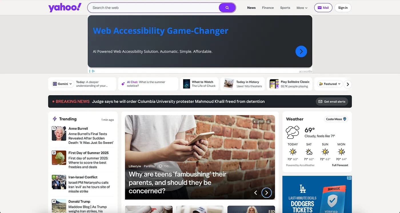
Clutter disrupts the flow of a room and makes it more difficult to establish hierarchy. Likewise, a website stuffed with buttons, ads, content, and images can feel overwhelming. Yahoo is example of a site with no negative/white space. Every module — the search bar, ads, trending section, weather, you name it — is separated by just 16px. When every element is fighting for attention, none of them succeed.
Whitespace matters in UI design. This is especially important in designing for mobile devices, which is roughly 60% of global web traffic. This is even true with typography, where the proper amount of whitespace around each character makes it easier for us to read. The takeaway: sometimes less is more.
Famous graphic designer Paul Rand, who’s designed more icon logos than you can image, said “everything is design”. So it should come as no surprise that there are so many similarities between the two, because good design can be applied to everything. The same principles that make a home feel cozy or a website intuitive can apply to school curriculum, workflow processes, even weekly meal prep. Good design, whether digital or physical, makes us think less and live more simply.